Haben diese beiden diskutiert. MIt der Folge dass Precht seine Honorarprofessur in Lüneburg aufgibt, weil…
The desktop – mobile war
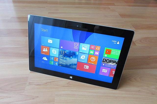
Microsoft was the first to attempt the merge of a touch and desktop world. They tried hard but they failed – at least as of now. Read why Windows 8.1 is the first of it’s kind and that although it’s failure it still is a very important step into the era of a new kind of Operating Systems.
Top, bottom, left right – why the right place for meta menus is not on the „right“ hand side!
I guess Android was the first system to introduce a menu that can be dropped down by swiping into the screen from the top end. Major Jailbreak tool „Jbtools“ implemented a similar toolbar feature by swiping from left to right on the time status bar in IOS. Apple soon recognized that peaople wanted quick access njot only to the time and the carrier service level but also to crucial features like News and later even the „flight mode“, „wifi“, „bluetooth“ and „brightness“ switches.
Later apple introduced another meta menu, which could be slided up from bottom. The top menu now had all news and push infos while the bottom menu finally housed all important switches. This was smart and the jailbreak community did an important job pointing into the right direction.
So, now all major mobile OS have such features which proove useful on a daily basis for millions of users. But what about the desktop systems?
Desktop – What happens when a system lacks attention
All major efforts on ergonomy in the past years were focused mainly on mobiles devices and their operating systems. IOS quickly developed from a rather disappointing system to a now sophisitcated and stable environment. MacOS has a hard time to follow up on the progress. It still builds on an annoying 90s attempt to imitate something like a taskbar called the „dock“. It took long to create a mac app store which still is not nearly as popular as the mobile twin. And even in regards of hardware there is a great gap. Touch support for MacOS? No. Retina Displays for Mac? No. See, the mobile sector dominates not only the software but also the hardware innovation.
What about Microsoft?
The first attempt to combine touch and desktop worlds: Windows 8.1 – The Teardown
It was microsoft to first create a system that tries to combine both touch and regular desktop systems. Wnows 8 started a new era. But as often with the first ones. It failed. At least for now. Microsoft changed too much and made too much comoplicated to really beat a chance against others. I hope windows 9 will come soon.
What is wrong? WIndows 8 introduces a charms bar, whch can beacces by swiping from the right edge of screen to left, or touching the top right corner with the mouse. What a mess already. Even more problematic if you consider that monitors are getting wider, not taller. So the right edge is always morre and more far away. top and bottom are far better places for such a meta.
With windows 8 microsoft tried to kill the taskbar and replace it with a fullscreen taskbar called metro (or „Modern UI“). Basically this was not as bad as many people stated, cause it had all the functionality and the start menu was, from a consistency perspektive, not well designed. The problem that arises is that with the metro interface microsoft also tried to create an environment for metro apps, which work independend from the desktop. The desktop itself felt like being reduced to an metro app as well.
The result is having 2 worlds and none of which is perfect. Metro apps have a task switcher whch is located left of the screen, desktop apps have the regular windows taskbar in the bottom. What the heck is that? This is weird design at its best.
Microsoft tried to make basic settings and functionality to appear as built in as possible but failed as well. Wifi? Well done, works, loks solid in the taskbar as well the charms bar. Loudness? Yep the same. Brightness? Nope. In the carhms bar but not in the taskbar, Bluetooth? oops. just an software icon in the taskbar. This does not look like native support. And this is where most of the pronblems arise.
Inconsistency at its best
Windows 8 is inconsistent in many places. The taskbar and the app task bar on the left, should be one. The metro apps should launch on an desktop like environemnt, the charms bar should be in the top and have more options. Which then, on the other hand, should not be doubled in the taskbar.
Mouse and touch control should be similar and not completely different things. baa. Sometimes I wonder, if they really tested that stuff. What were they thinking!!
To be continued…
Dieser Beitrag hat 0 Kommentare